When I got a new car in December of 2018, I knew that I had to do something with the data that I saw when I was pumping gas. Every time I filled up starting in January 2019, I recorded the number of miles I had driven, the number of gallons I pumped and the total cost of the gas.
I recorded these three things in a .csv on my laptop. After I had recorded a few fillups, I cracked open a .py file and got to work. I used DarkSky API to pull in weather data as well. This gave me a chance to see how my miles per gallon was changing while the weather was changing as well.
After a year of pulling data, I'm ready to report my findings!
Here's a link to the dashboard

The first thing I noticed is that my miles per gallon during the summer is relatively consistent compared to my miles per gallon in the colder months. I think this is because over the summer I drove the same route to and from work every weekday. For the most part, I drove with the same speed with the same traffic. While school was in session, my driving wasn't as consistent. If I took a trip on the weekend, I would get better miles per gallon because I'd be on the highway the whole time. Maybe one week I had a lot of errands to run in the city, which means a lot of stopping and starting and lower miles per gallon.

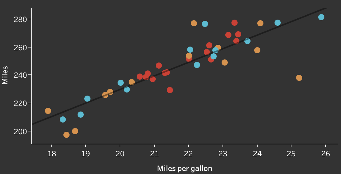
The bottom left chart shows my miles per gallon graphed against the number of miles I drove between the fillups. This is a positive linear relationship because when my car gets better miles per gallon, I don't need to stop for gas as often. I'd suspect that the fillups where I got really high miles per gallon are fillups where I was driving on the highway a lot.

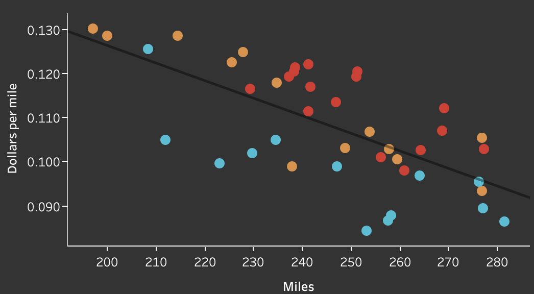
The bottom right chart shows that as I drive more miles, I burn fuel more efficiently and I get lower dollars per mile - which is good! What's interesting to me is that I get better dollars per mile in the winter months. I asked a friend of mine who loves cars and engineering, and he said it's probably because of thermodynamic efficiency.

On the top of the equation (Q Hot - Q Cold) let's call that ΔT (as in change in temperature). The bottom, Q Hot, is constant because gas burns at a constant (or almost constant) temp. In the winter, the temperature is lower and ΔT is higher because cold air is heating up more compared to warmer air where it doesn't have to heat up as much. Because of the higher change in temperature, air expands more which means more power in same amount of gas. Literally more bang for your buck!

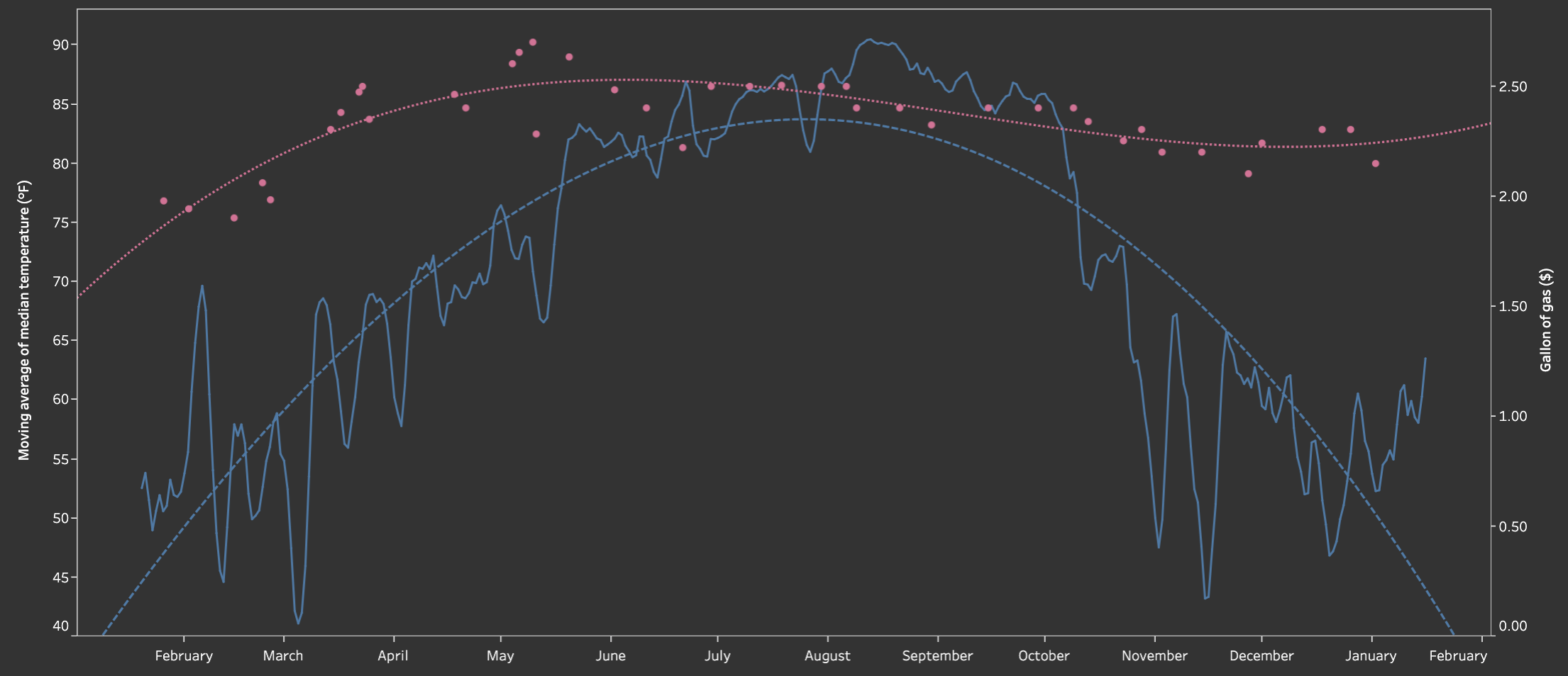
The next tab shows the moving average of the temperature graphed with the cost of a gallon of gas. I always had a feeling that gas prices rose as it got warmer, and this chart kind of shows that. It mainly shows that there is a crazy variation in the temperature in Austin, TX during the spring and winter - something I definitely already knew!
Here's the github repository for this project.
Update (1/21/20)
I had been toying around with the idea of creating a table with the insights I had printed out when running mpg_refresh.py. But I finally but pen to paper, or fingers to keys, today and got it done.

This will be interesting to track every few times I fill up, especially the miles per gallon. Also, it's good to know how much it costs me to drive a mile. That's a cool insight!